
A Visual Refresh
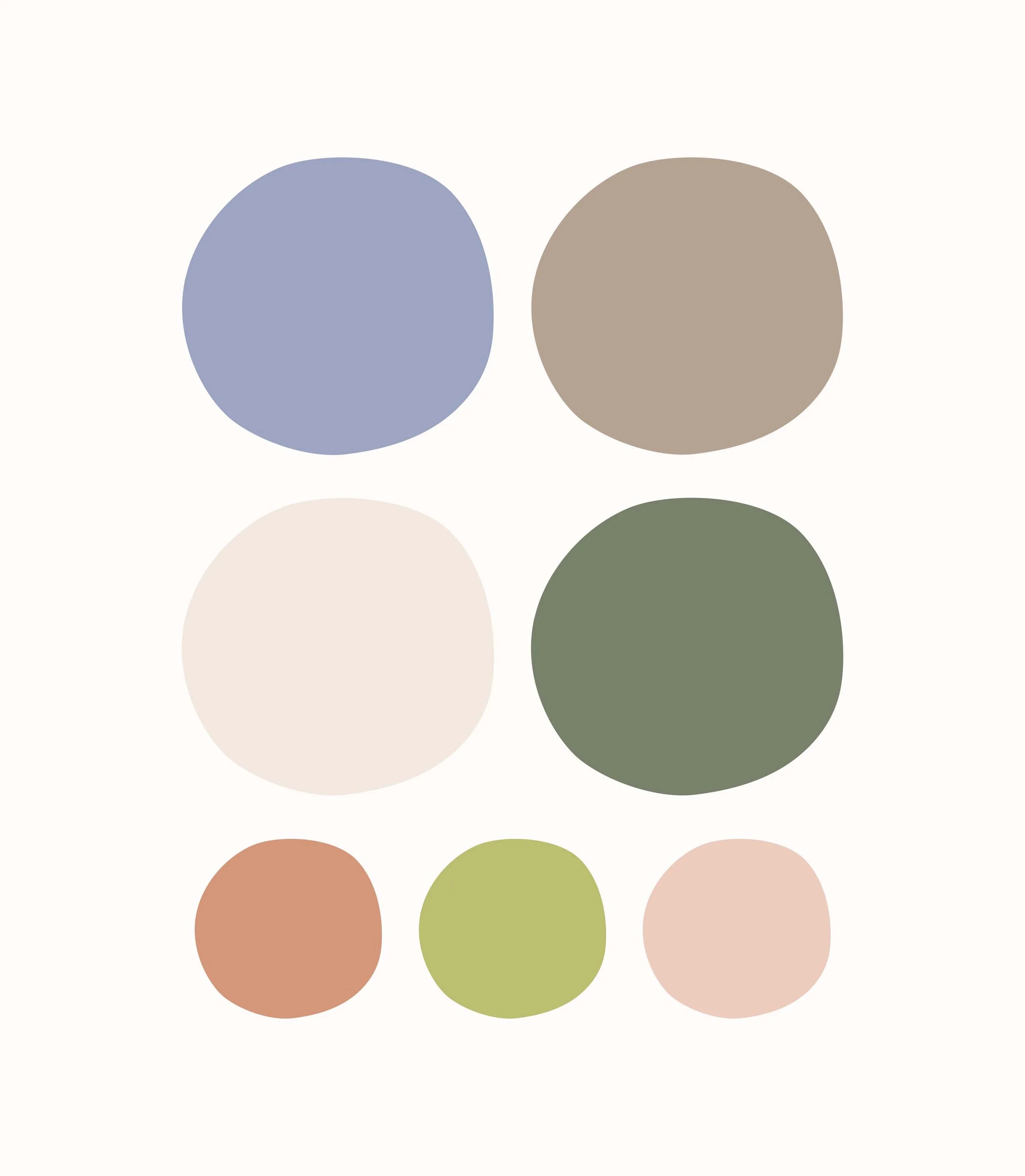
A brand built on transparency should look as pure and gentle as the products it offers. This visual identity refresh for Made Of preserves the brand’s core elements while reimagining its look and feel. Shifting from bold, synthetic hues to an earthier palette puts the brand’s commitment to natural ingredients at the forefront. Hand-drawn illustrations weave in a sense of care and craftsmanship, highlighting the wholesome elements inside every bottle and pack.
Rather than altering the logo, the refresh places it at the heart of the packaging. It now serves as the focus of the brand story, working in harmony with organic graphics to reinforce the brand’s ingredient-first philosophy. Elements of the logo, like the leaf and circular shapes of the letters, are now integrated into the new brand illustrations to tie everything together.
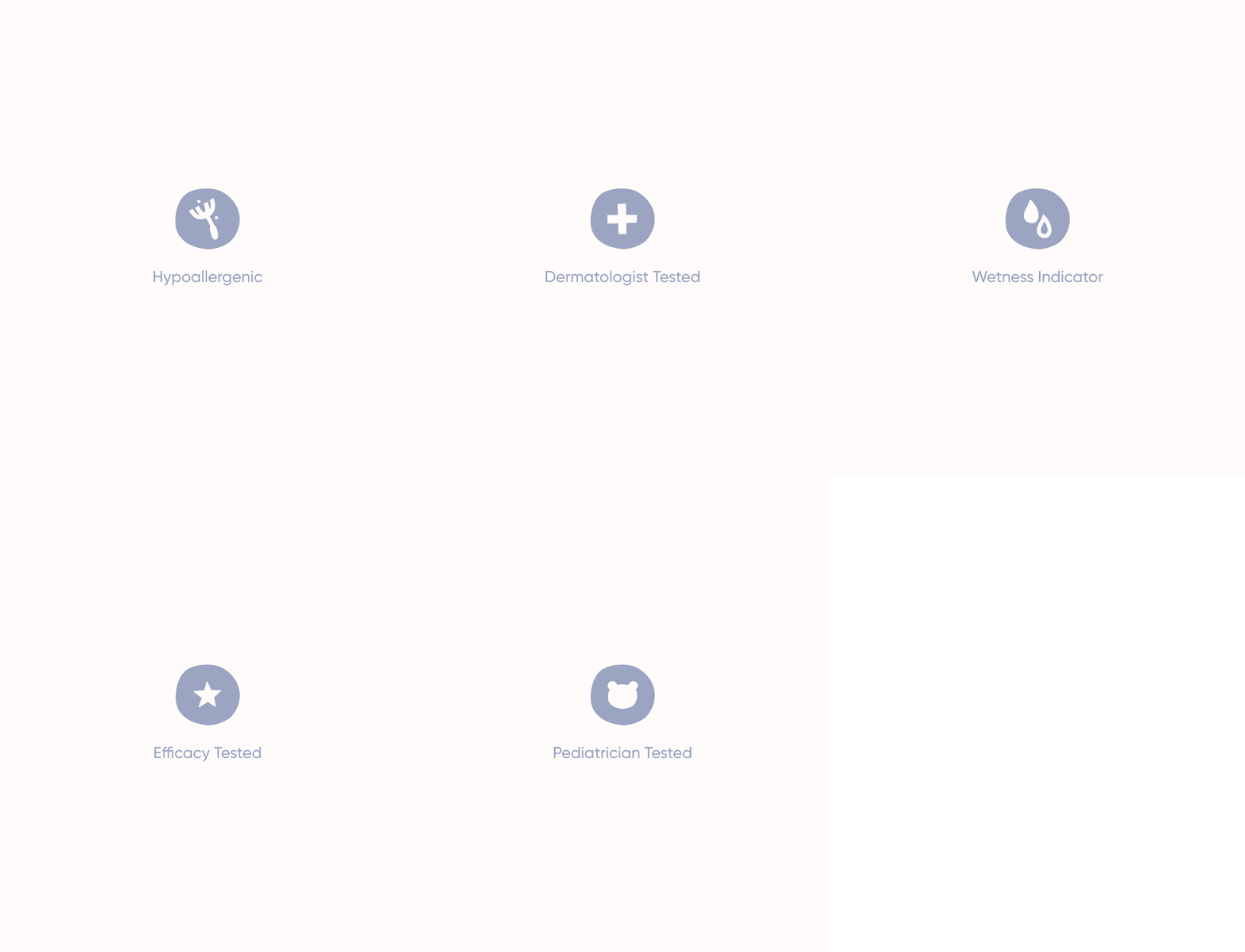
The refresh extended across packaging, iconography, illustrations, and photography, creating a more cohesive and calming presence on the shelf. The resulting visual identity speaks to parents in the same way the brand does—honestly, gently, and with their little one’s well-being at heart.
Visual Identity
Art Direction
Packaging Design


The Packaging
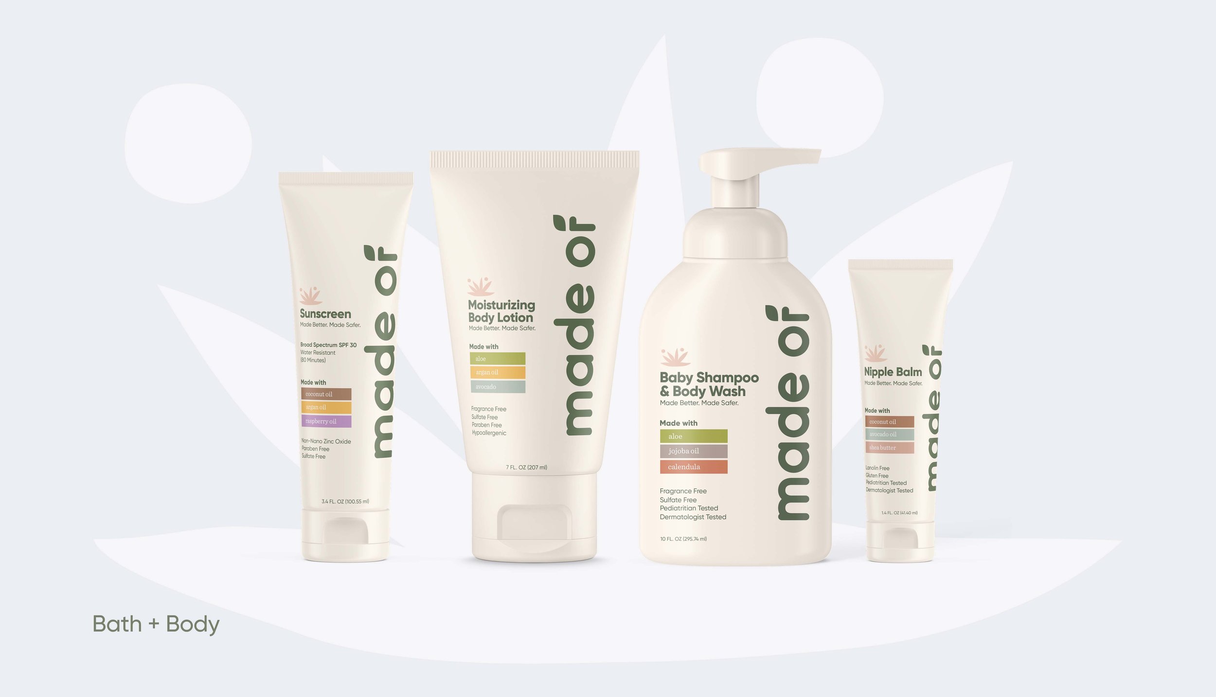
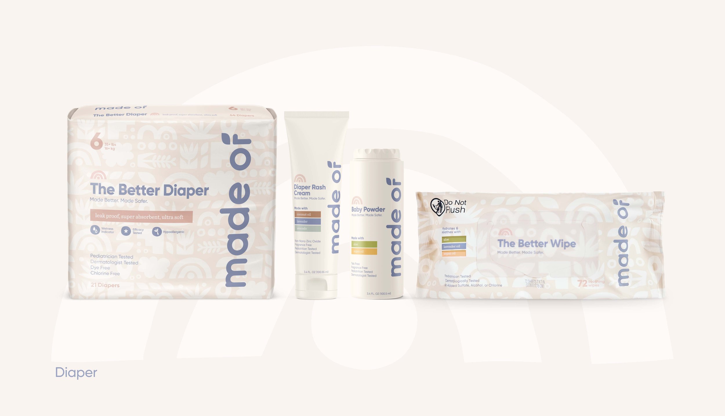
With only seconds to capture a shopper’s attention, the packaging needed to communicate Made Of’s natural, “good for baby” promise at a glance. The boldly placed logo takes priority, reinforcing the brand’s commitment to transparency, fearlessly putting ingredients front and center for parents to come see what Made Of is, well, made of.
A warm, ingredient-inspired color palette follows, bringing a softer, more natural feel while also signaling key active ingredients. Each one is highlighted in its own unique hue, making it easy to identify across products. Whether on a large diaper pack or a small tube of balm, the design system scales while maintaining a consistent, recognizable look.


