
The Visual Identity
SleepingBaby is a kids sleepwear brand dedicated to helping little ones (and their parents) get the rest they need.
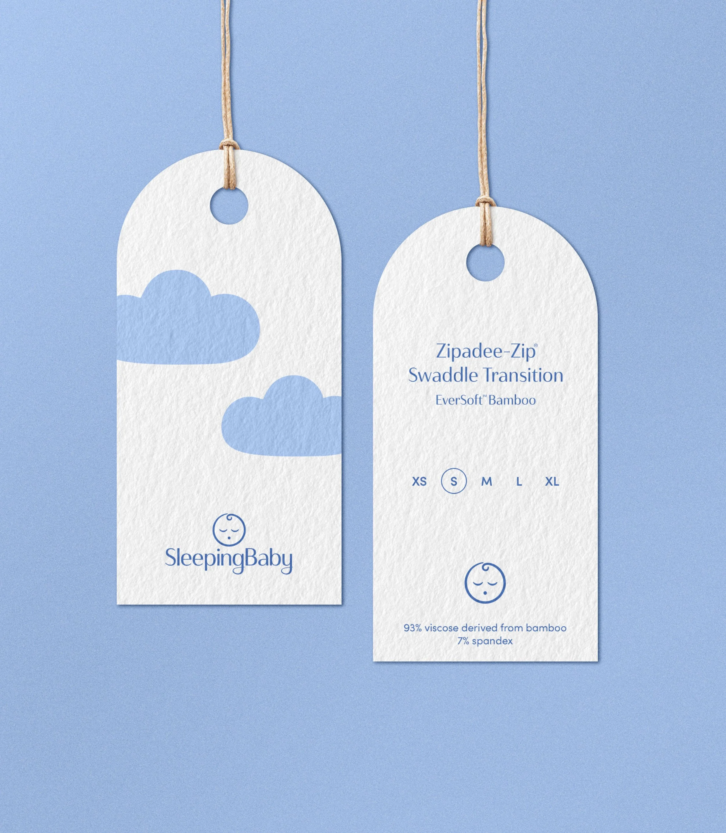
Designed to embody the serenity of sleep, the visual identity for SleepingBaby uses a soft palette of blues and pastels to create a sense of calm. Gentle, playful design elements—a drifting cloud, a crescent moon, twinkling stars, and a sloping horizon—nod to nighttime tranquility and a child’s sense of wonder. Typography reinforces this balance, with a primary typeface that gently curves and slopes, evoking a sense of softness, while the secondary typeface features simple, structured letterforms reminiscent of children’s building blocks.
Imagery captures moments of love between parent and child, joyful toddlers, and calm, sleepy babies, creating a world where rest feels effortless and dreams take flight.
Visual Identity
Art Direction
Digital Design
CREDITS
Photography: Mary Horne Nelson, Katie Moss
Web Design: Sofia Svensson-Huang
Copy: August Braun


The Digital Experience
The SleepingBaby digital experience extends the brand’s sense of calm across every touchpoint. The website is designed with tired parents in mind, employing the soothing color palette and an intuitive layout that makes finding sleep solutions effortless, even in the middle of the night. On social media, the brand strikes a balance between education and joyful parenting, offering helpful sleep tips, gentle guidance, and uplifting moments, all presented with SleepingBaby’s signature style. Ads never yell, instead they embody the idea that the best, most peaceful moments of parenting are within grasp.

Final web design by Sofia Svensson-Huang.
Included here to show visual identity in application.


