The Visual Identity
Downtown Barkery is an upbeat, charming dog treat brand on a mission to celebrate the joys of pet ownership with delicious baked treats worthy of every tail wag. The brand was developed under Downtown Pet Supply, with the goal of bringing in new, younger customers to the portfolio.
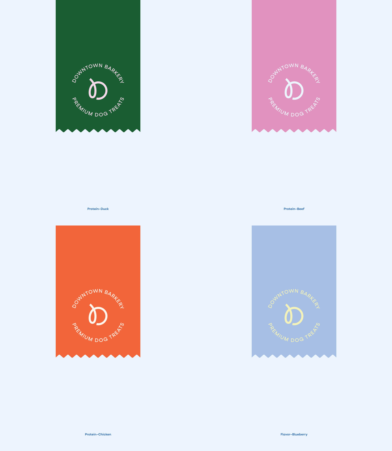
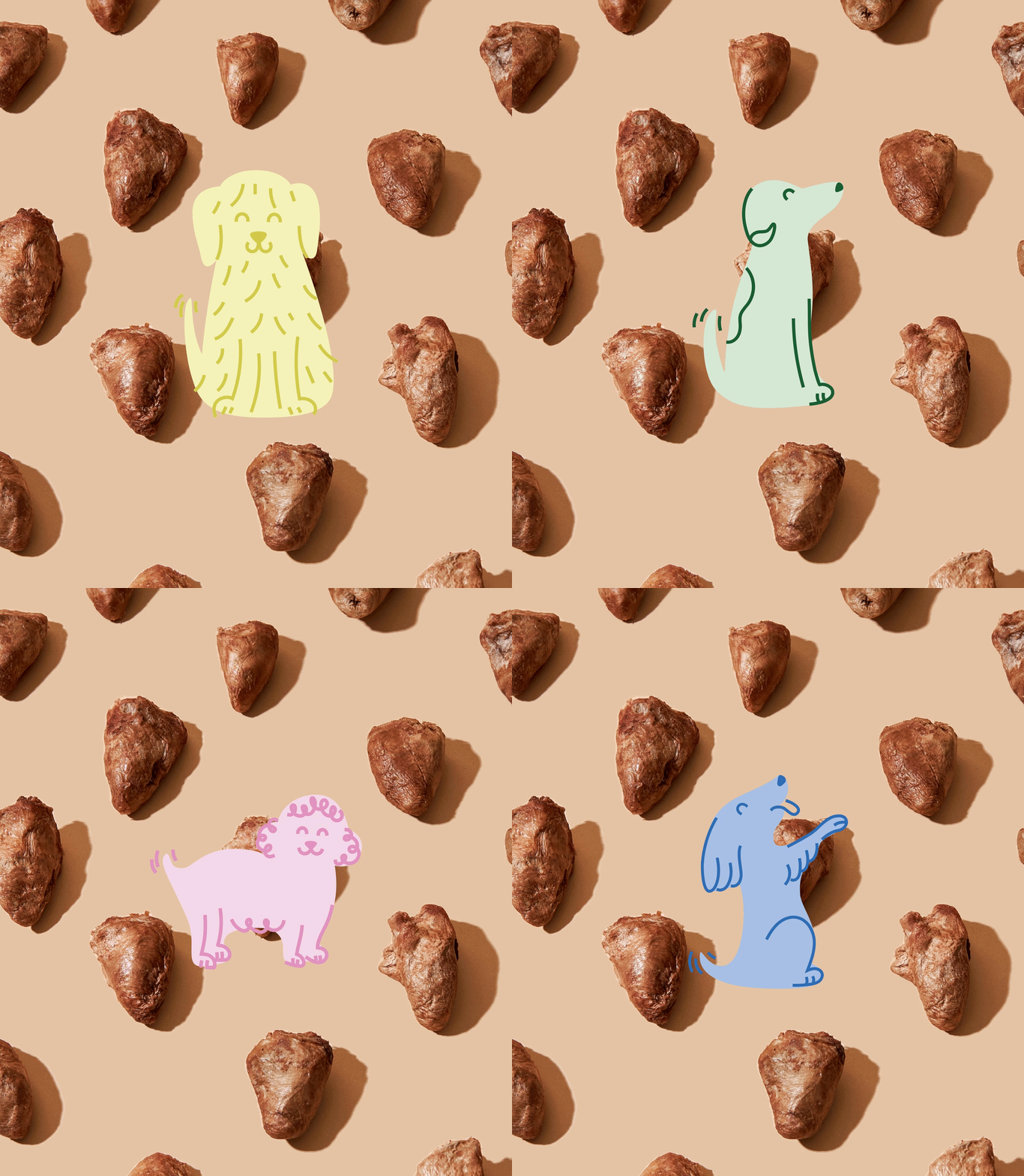
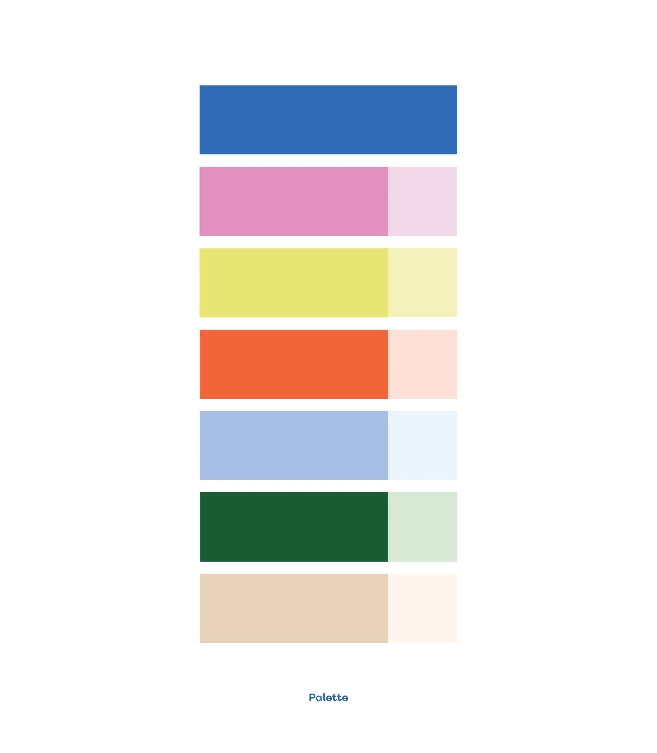
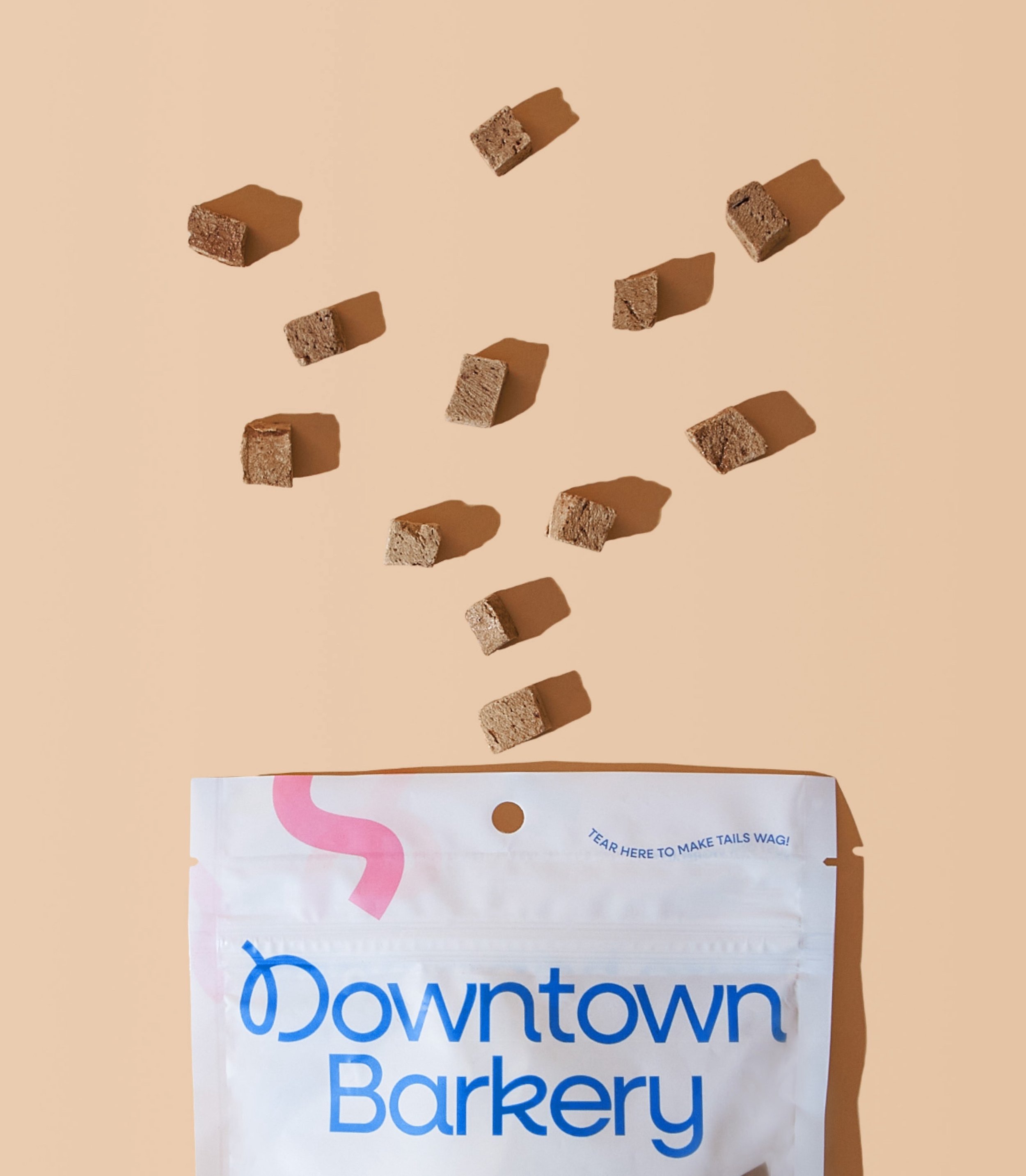
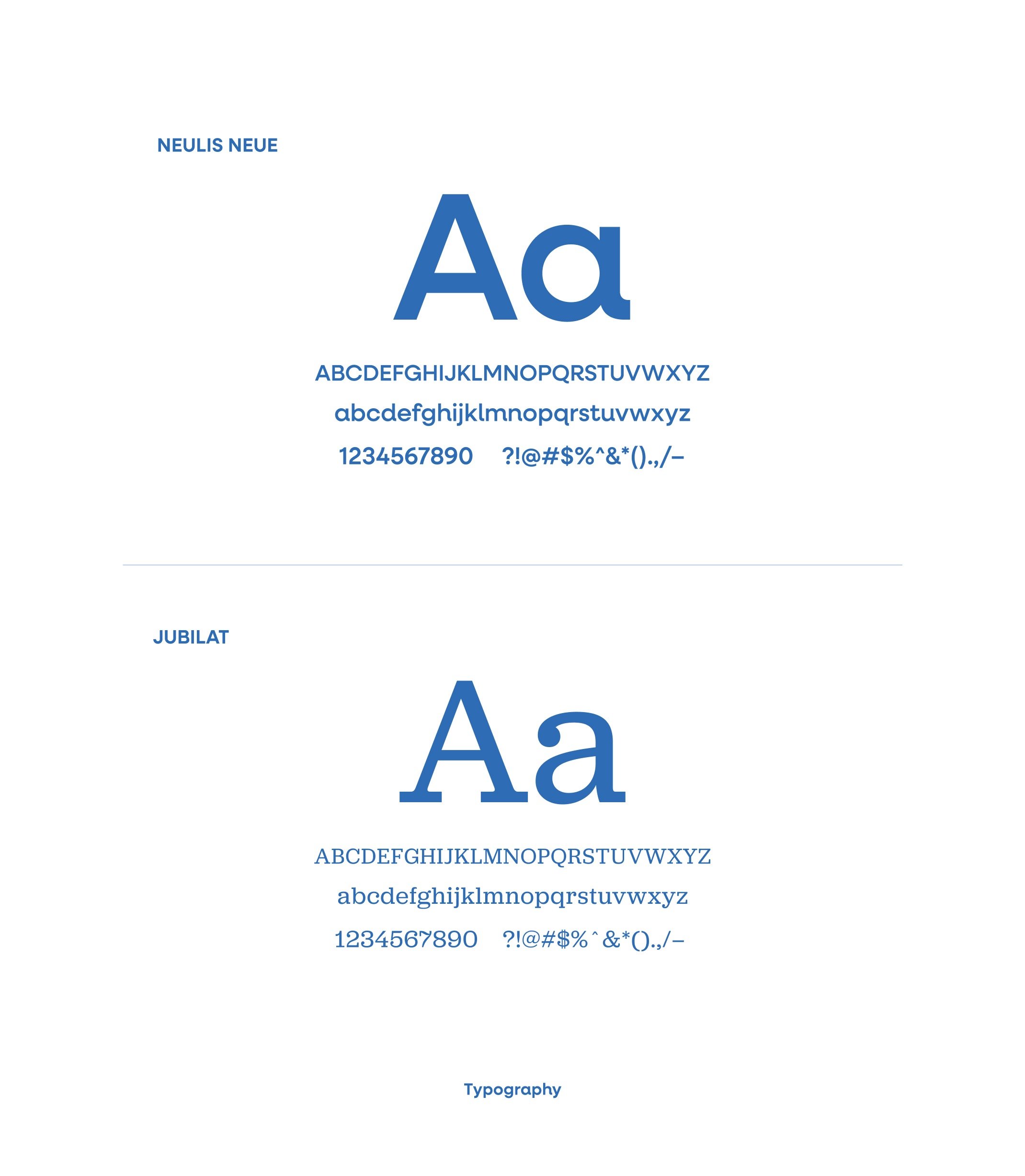
Paired with a friendly, clever tone—think playful taglines like “Treat ‘em right” and “Tear here to make tails wag”—the visual identity captures the joy of treating dogs while delighting their humans. Elements inspired by classic bakeries meet bright colors and bursts of confetti to give the brand both a playful and recognizable feel. The logo mark nods to an ink stamp you might find on bakery paper with a curling ‘D’ at the center that resembles a piece of falling confetti. The colorful palette, grounded with tints and neutrals, ads contrast and energy to the natural colors of the baked treats. Product photography supports the bakery motif with grid-style treat layouts and ingredient showcases . Each element in the visual identity works together to reinforce the union of familiarity and pure happiness–just like pet ownership.
At launch, Downtown Pet Supply saw a significant bump in 25-35 year old shoppers and the Yak Chews outperformed their forecast selling out early due to demand.
Visual Identity
Art Direction
Digital Design
Packaging Design
CREDITS
Product Photography: Lauren Edison
Copy: August Braun, Sam Omer
The Digital Experience
Downtown Barkery’s digital presence strikes a balance between simplicity and charm—making it easy to shop without losing the brand’s playful spark. Navigating flavor, size, and subscription options is made simple with a layout designed to be straightforward and not overwhelmed by unnecessary colors, text, or dropdown menus. Pops of color are instead infused through imagery, letting the treats—and their wholesome ingredients—take center stage.
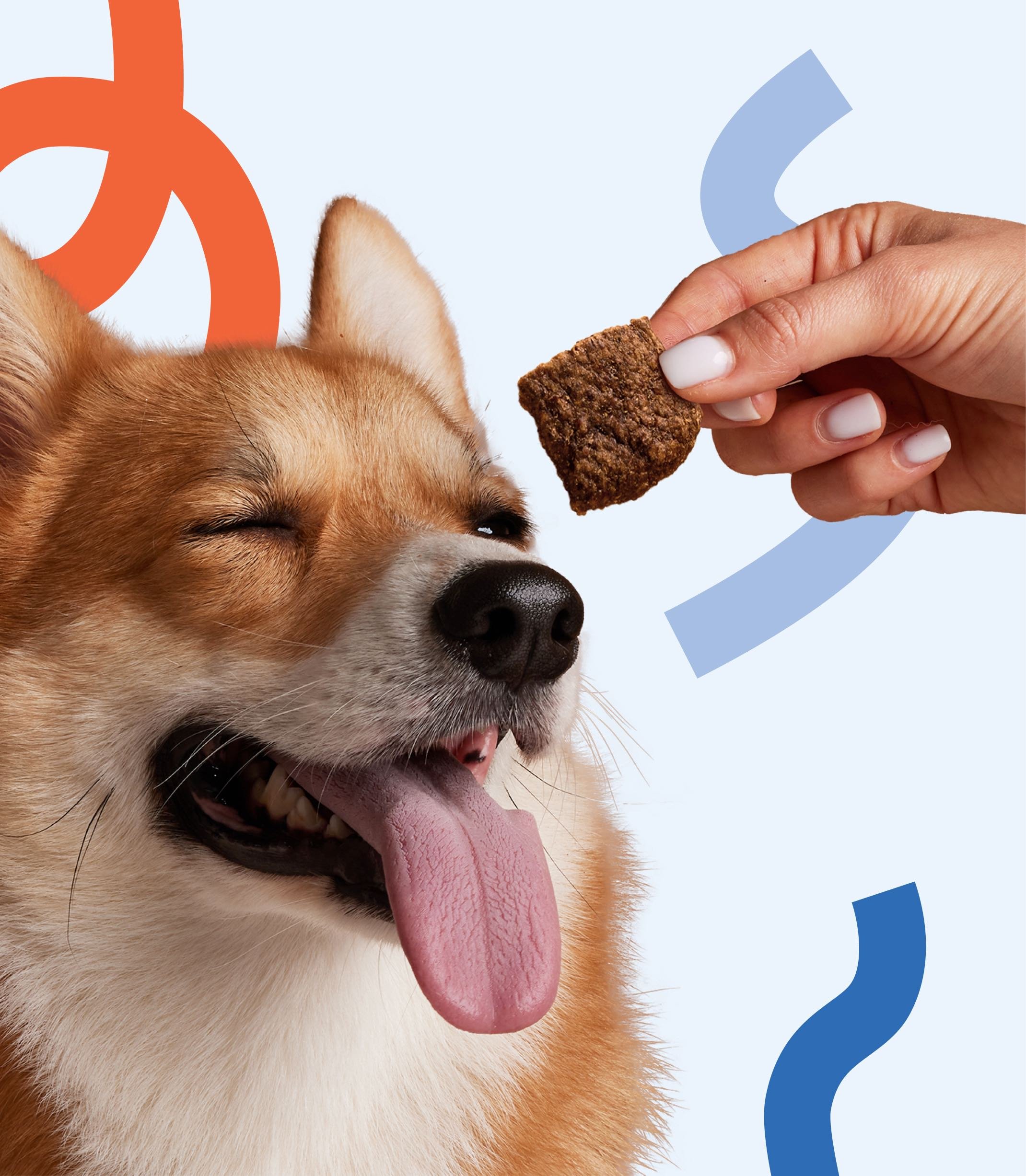
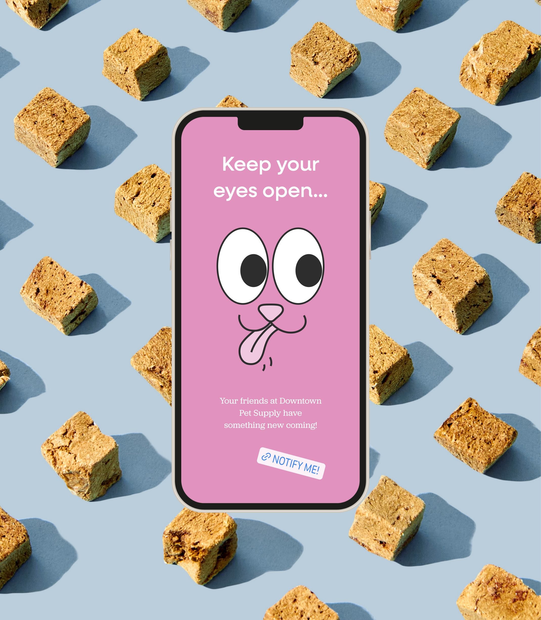
Across ads and digital touchpoints, bold visuals and cheeky messaging come together to grab attention, spark smiles, and keep the celebration going.


The Packaging
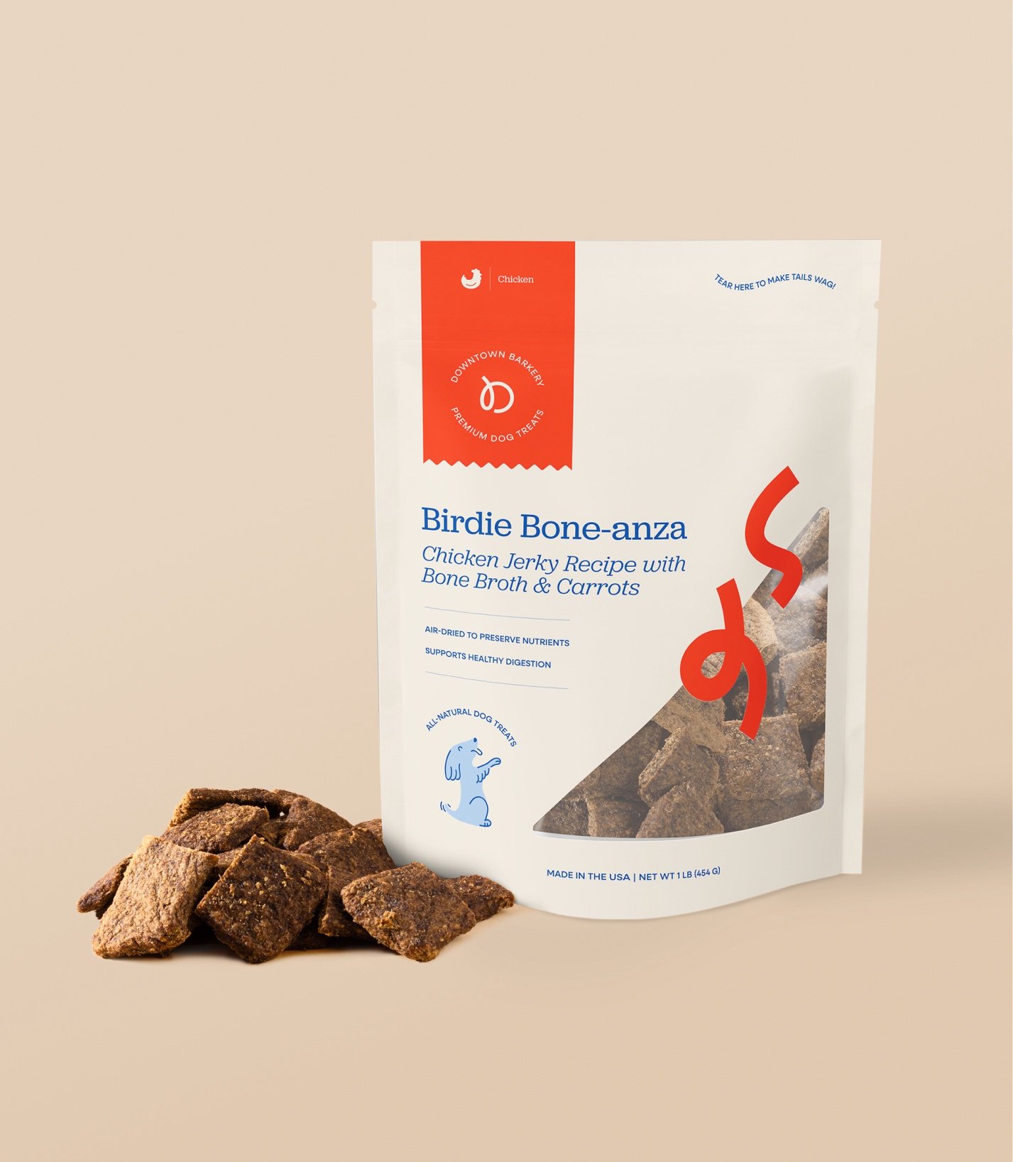
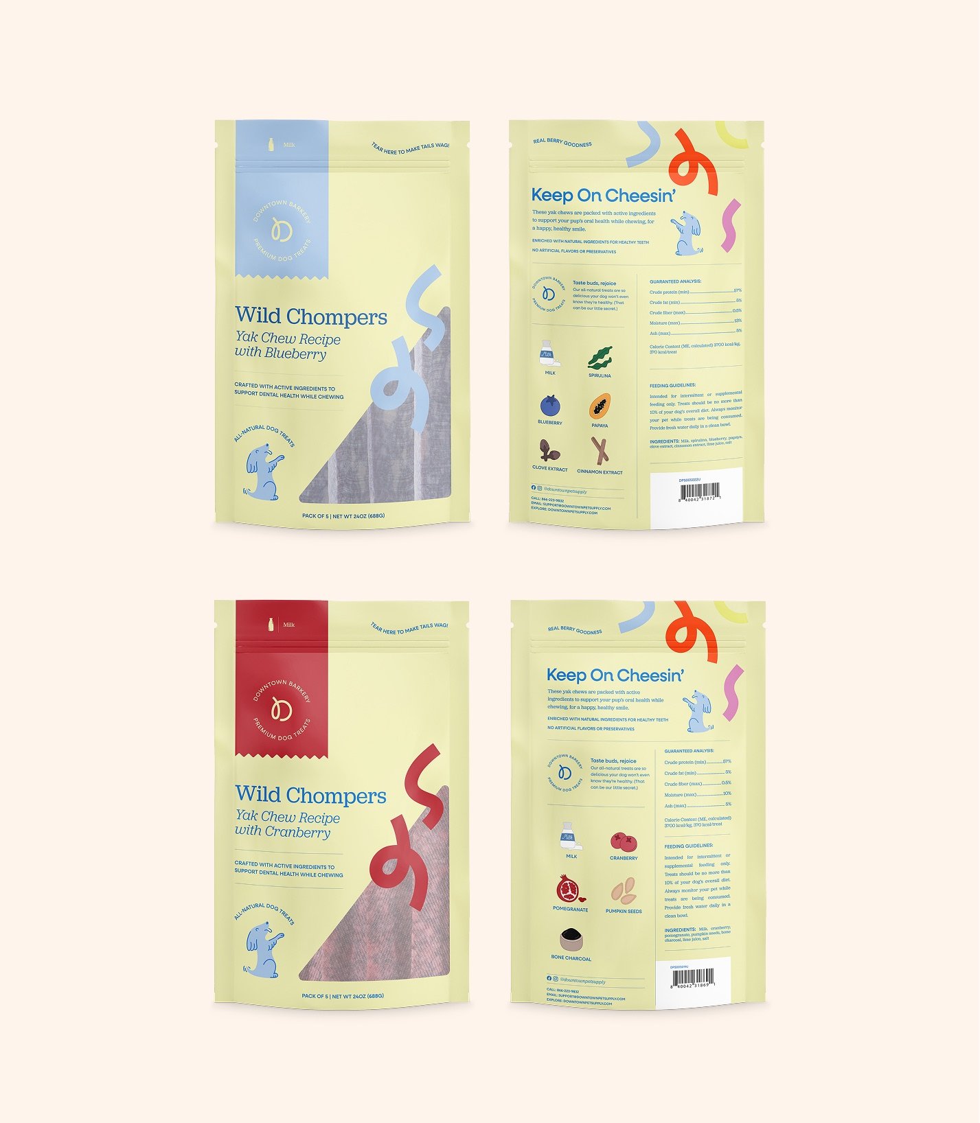
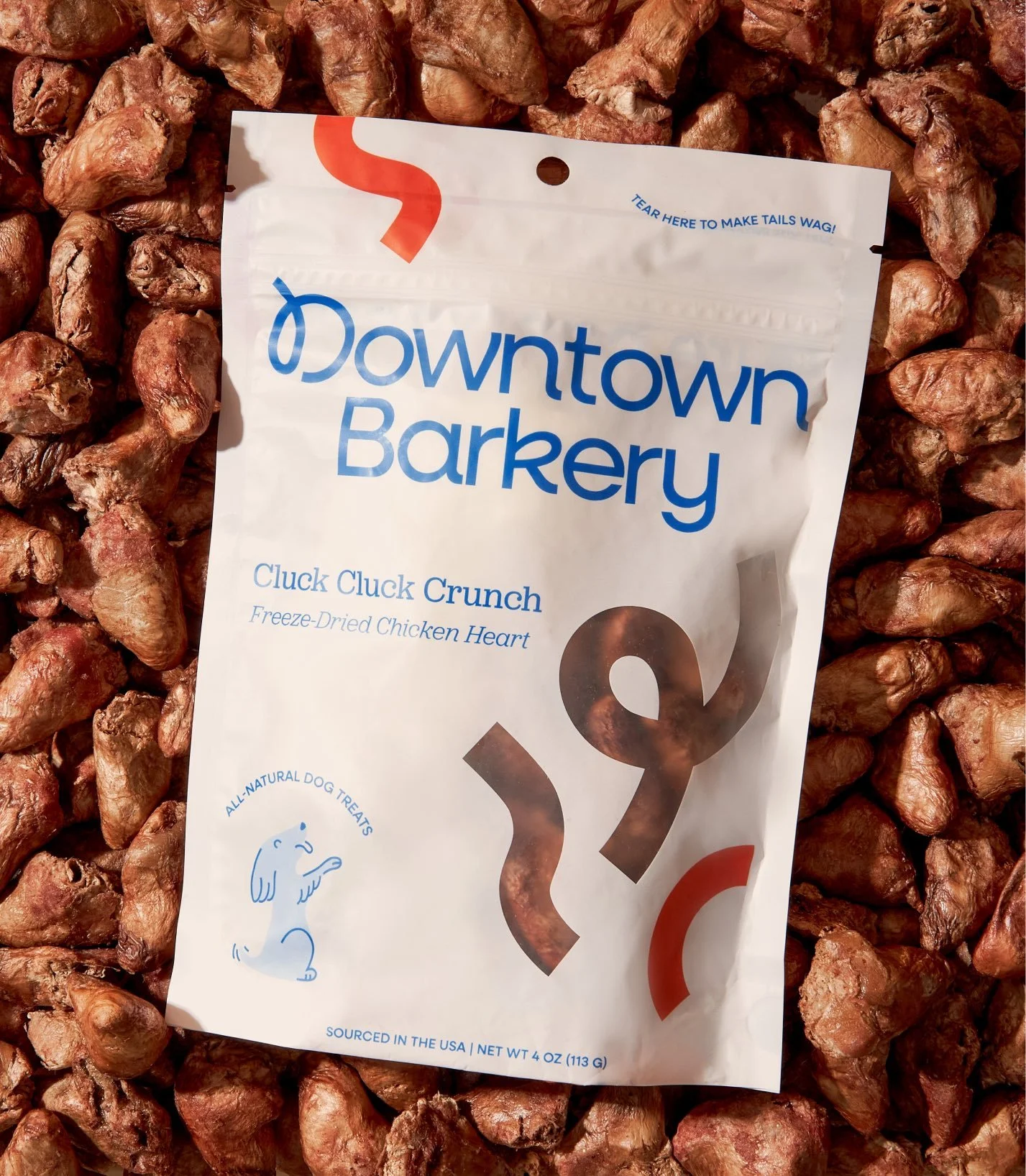
Embracing the idea that each treat purchase should feel like a little celebration, the packaging was designed with the same charm and wit that is infused throughout the rest of the brand. Design elements were chosen keeping in mind how customers in the pet space are familiar with shopping while adding Downtown Barkery’s unique sense of playfulness to each package.
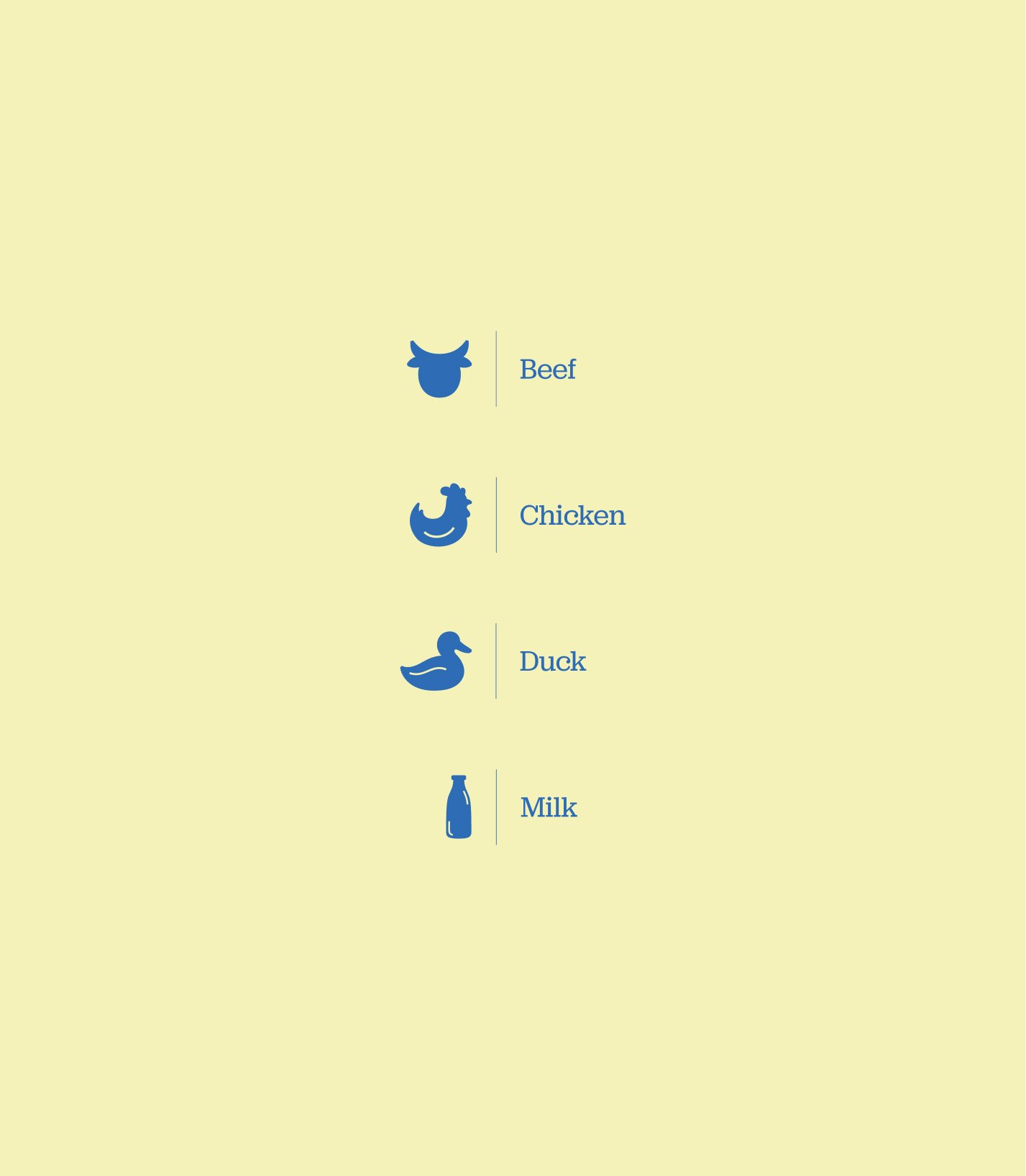
Colors pairings vary across the whole treat line, changing based on ingredients and offering quick visual cues to protein type or flavor. Bakery motifs are infused throughout each bag design—an angled transparent window is a nod to a simple bakery box and a strip of tape with the logomark nods to the seal you might see on the bag of a fresh baked loaf from your local bakery.

